

“Today we begin the final phase of this major change where Aptos will start appearing as the new default font across Word, Outlook, PowerPoint and Excel for hundreds of millions of users,” explains Si Daniels, a principal program manager at Microsoft, in a design blog post today. “And, over the next few months it will roll out to be the default for all our customers.”“Today we begin the final phase of this major change where Aptos will start appearing as the new default font across Word, Outlook, PowerPoint and Excel for hundreds of millions of users,” explains Si Daniels, a principal program manager at Microsoft, in a design blog post today. “And, over the next few months it will roll out to be the default for all our customers.”
I’m not sure I understand why they want to replace Calibri, but I guess a fresh typeface every now & then isn’t a bad thing.
What do you all think of this Aptos?
Although I prefer Aptos over Calibiri, the change isn’t that drastic. Aptos kicks the absolute fucking shit out of Calibiri when it somes to common symbols like @ ; and ?, but it’s slashes don’t match, which is a choice.
MS should’ve been been more bold, and make something like Conthrax the default.
I don’t know:
To me, that makes Aptos look kinda square/blocky, at least this variation, compared to Calibri. I can’t seem to find the full typeset though. Do you have a link to something showing all of the characters?

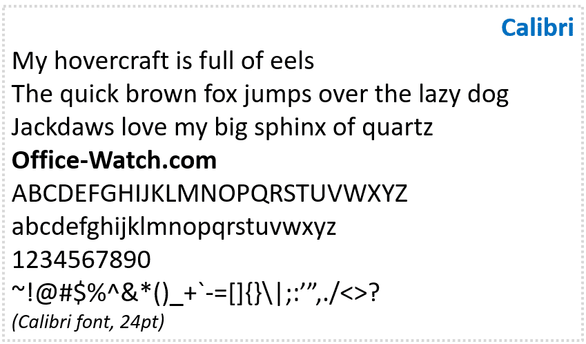
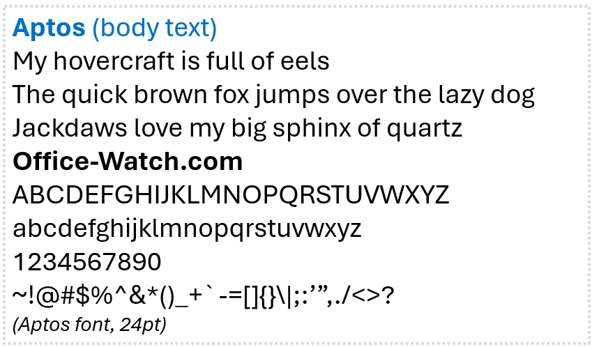
Aptos: grotesque/neo-grotesque, more in common with Helvetica/Arial.
Calibri: humanist, squarely in the Frutiger knockoff family.
Tangential: strange though how brief Calibri’s reign as default font was, even after the US Government declared it the official document font (replacing Times New Roman) by resident typography expert, Antony J. Blinken.


