https://ismy.blue/

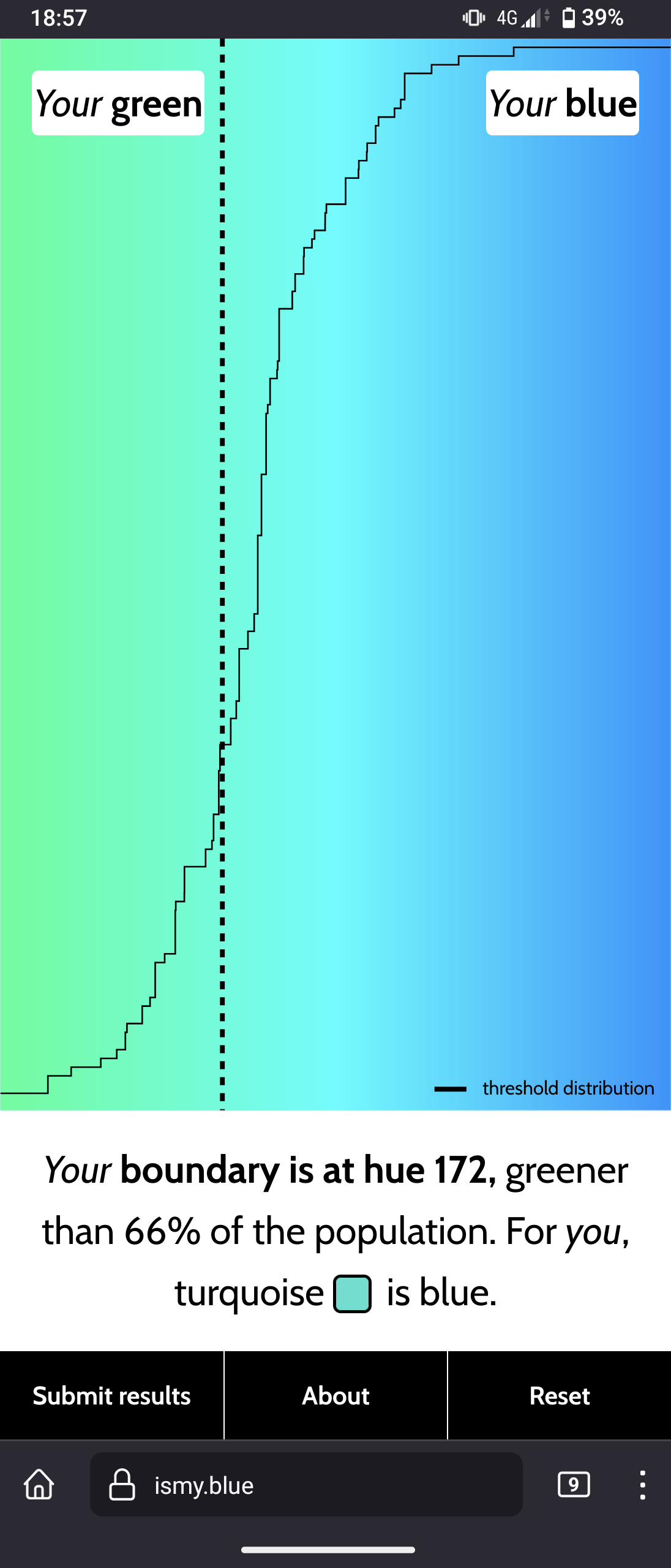
Interesting website to see what you personally perceive as “blue”

You are viewing a single thread.
View all comments View context
3 points

I don’t think turquoise and cyan are the same color. Are you saying you do?

permalink
report
parent
reply
6 points
*

Yup, maybe because of computer graphics; I tend to consider Cyan, Turquoise and Teal as some kind of synonyms (or really similar to eachother); ususally I call it when there is almost as much green as blue “Cyan”

When looking at definitions, there are not the same colors, but are still all different shades of Green and Blue (I don’t personnaly recognize them well, so I consider them with the same name; like people call them Green or Blue here)

My rainbow wheel be like: Red - Orange - Yellow - Green - Cyan - Blue - Purple - Magenta - Red

Like for the pixels on your screen are RGB = Red, Green & Blue; and the paint in Inkjet printers are CYMK (Cyan, Yellow, Magenta, blacK)

permalink
report
parent
reply
2 points
*

If you start out with the primaries and keep mixing to get the hues between you’ll end up with 6, then 12, and then 24 hues at the quaternary level. Orange is a tertiary color with it’s opposite being Azure.

permalink
report
parent
reply
2 points

Yeah, particularly digital to print graphics, working with CMYK had a similar effect on me.

permalink
report
parent
reply
1 point

Ah. Teal/Turquoise are the same to me: a blue green. Cyan is a neon light blue.

Cyan, #00FFFF: https://www.canva.com/colors/color-meanings/cyan/

Turquoise, #30D5C8: https://www.canva.com/colors/color-meanings/turquoise/

permalink
report
parent
reply
2 points
*

According to your website, teal would be a darker shade of Cyan

Teal, #008080: https://www.canva.com/colors/color-meanings/teal/

And by what I read #30D5C8, so Turquoise is a nuance near to Cyan, but grayer/desaturated (there is a bit of red), and a bit more towards green than blue (D5 > C8)

Cyan/Teal (darker cyan) are the true middle between Green & Blue, with exactly as much green as blue in it

permalink
report
parent
reply
2 points
*

The issue with the term light blue is that people think of light as being warmer and green tends to have a higher chromatic luminance. A true “light blue” would actually be periwinkle as it’s the tint of primary blue.

permalink
report
parent
reply

Art & Design

!artdesign@jlai.lu

Create post

🇬🇧 This is a bilingual community on a french instance.

Total subscribers:

🇬🇧 Let’s discuss art and design!

Join us and

  • 📰 share art news
  • 💡 share art tips
  • 🖼️ share your own art
  • 💬 share your opinions
  • 👁️ share your inspirations

This community is about art in all its form, as well as its influence on culture and its application at the service of society: architecture, music, literature, performances, video games, graphic design…

Check the pinned posts for basic rules and a (wip) list of art related communities 🔗

🇫🇷 Discutons d’art et de design !

Vous pouvez ici :

  • 📰 Partager l’actualité
  • 💡 Partager des astuces
  • 🖼️ Partager vos créations
  • 💬 Partager vos opinions
  • 👁️ Partager ce qui vous inspire

Le sujet de la communauté concerne toutes les formes d’art, ainsi que leur influence sur la culture et leur application au service de la société : architecture, musique, littérature, performances, jeux vidéos, design graphique…

Pour toute question, suggestion, réclamation, etc. N’hésitez pas à utiliser le sujet épinglé.

✅ Les règles de l’instance s’appliquent bien évidemment.

Community stats

  • 173

    Monthly active users

  • 339

    Posts

  • 324

    Comments