

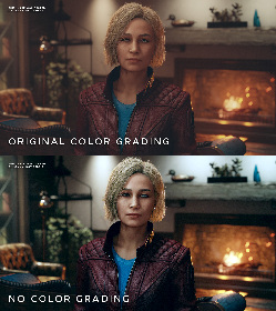
I’m not saying color grading is a bad thing, but I personally prefer natural lighting in games over “cinematic” filters.
See more examples: https://imgur.com/a/z6zyTo4
The first one looks natural to me. The second grade looks like a 1st year film school grade where they think the full range has to be used at all times. In a soft well lit room the contrast would never be that high.
The intention was clearly to make it look like a warm interior, adding all those grungy green tones make it look like she’s standing by a window. I dunno the context of the room, but number 1 looks way better to me…
Edit: Final thought - crushing blacks like that, from a game perspective means you may miss details that may have been meant to be seen. But power to you! Options are always better.

![[OC] I think the first mod I'll be installing / making will be one that removes the Instagram-esque filter Bethesda has chosen to apply everywhere(sopuli.xyz)](https://sopuli.xyz/pictrs/image/332f1f15-e869-478f-b5c6-2b5779ae83e2.jpeg)