

-20 points
*
20 points
2 points
*
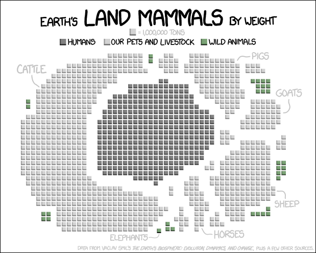
It’s like yesterdays post https://lemmy.ml/post/2352771 with a map of the US. The circle could represent earth.
10 points
2 points
It’s like yesterdays post https://lemmy.ml/post/2352771 with a map of the US. The circle could represent earth.
A place to share and discuss data visualizations. #dataviz
774
Monthly active users
143
Posts
3.2K
Comments

