


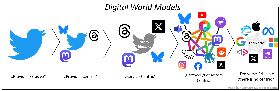
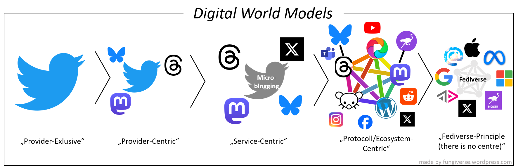
Provider-Exclusive: “There is only the app of my provider.”
Provider-Centric: “There exist other apps, but the one I’m using is the main one.”
Service-Centric: “There is no main one and I’m trying to use the one that fits my ideal the best.”
Protocol/Ecosystem-Centric: “There exist other protocols/ecosystems, but mine is the main one.”
Fediverse-Principle: “There is no main one and I’m trying to use the one that fits my idea of an open ecosystem the best.”
Current state of different web2 apps:

Yeah, I’m no graphic designer but the fediverse logo looks like a nightmare to render at small sizes, which is what designers are looking for in a logo, typically - something that is easy to recognize, tells something about the product, and scales well at all sizes, from favicon to building sized ad. I like that it conveys its own meaning really well, but it’s also extremely busy. So many crossing lines in such a small space just looks like a garbled mess at small sizes. Take this image and scale it down to 16x16px, you can see what I mean.


It also looks kinda like a pentagram, which might not work given some of their userbase.

Come on, it’s only eViL if the star is upside down. Any weekend warlock of metal fan knows that. Also, hail Satan.
It’s slightly askew, so neutral in the Pentacle-Pentagram spectrum. That wouldn’t matter to “PATRIOT DOG MOMMY 🇺🇸🇺🇸✝️🇺🇸🇺🇸 MAGA 2024” on Facebook though. Obviously Satan.


