


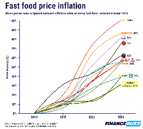
That chart is evil. First two ticks represent 5 years. Ticks 2-3 represent 2 years. The last two ticks represent 2 1/2-3 years!
Also, what’s so magical about 2014 that it deserves to be the baseline? I’d love to see this extended back to, oh, 2006 or so. Sometime before the Great Recession.
Finally, what about shrinkflation? I used to order from Panera on a regular basis, but during the pandemic, it seemed like their sandwiches shrank a little bit more between every order. At this point, I don’t think it’s even worth ordering from them.
The time line doesn’t matter since it is only comparing different brands to inflation, not against time. You could stretch the graph but the comparison will stay the same.
2014 is just chosen as a starting point. Most probably because the info was readily available. You can make the same graph starting from any point in time and the conclusion of the graph wouldn’t change.
Hard disagree on both points. If the time line doesn’t matter, why include it? It would be simpler to just plot the endpoints.
As for the conclusion, what if McDonalds kept prices the same from 2004-2014, but Popeyes doubled prices over the same time period? The final plots for 2024 would be in a different order. It would be a different conclusion. Unless nobody changed prices at all before 2014, you’ll have a different final result.
The timeline gives a general reference point. You’re right they could mostly just include 2014 and the final year as well. No big deal in my opinion since they don’t try to emphasize the price points at each year (as only a vague idea is given based on the line).
In terms of your second point, what if from '99 to 2003, Mcdonald’s had doubled their prices? the graph would be the same? We can keep going back until each business’s complete history, but I feel this graph tells enough of a story: Both brands increased their product costs a certain amount from the dates indicated.
Not to mention that a huge number of these businesses are locally owned franchises, where the parent corporation has less control over menu prices.
Many franchises are bound by a specific cost structure and predefined distribution.
