


-4 points
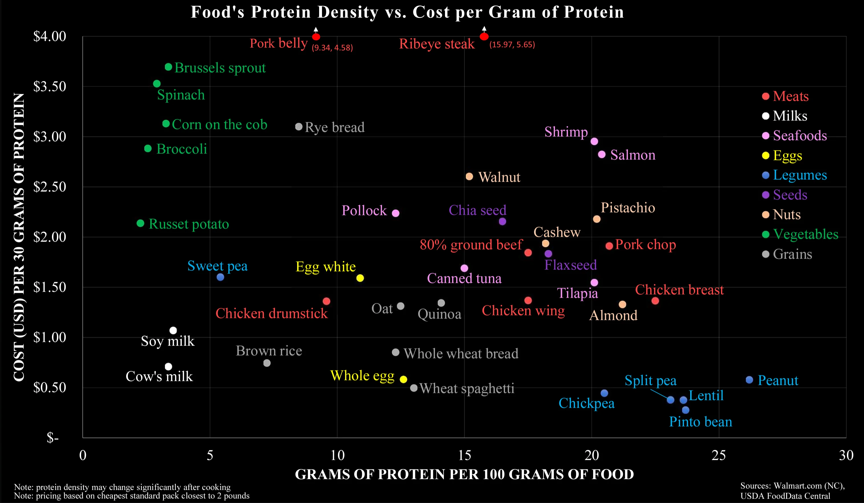
To me it seems that your interpretation completely disregards the Y-axis. On the other hand, I wouldn’t think the colour coding does a good job in separating along the carnivorous-vegetarian-vegan scale.

1 point
To me it seems that your interpretation completely disregards the Y-axis. On the other hand, I wouldn’t think the colour coding does a good job in separating along the carnivorous-vegetarian-vegan scale.
A place to share and discuss data visualizations. #dataviz
(under new moderation as of 2024-01, please let me know if there are any changes you want to see!)
545
Monthly active users
129
Posts
2.5K
Comments

