

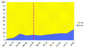
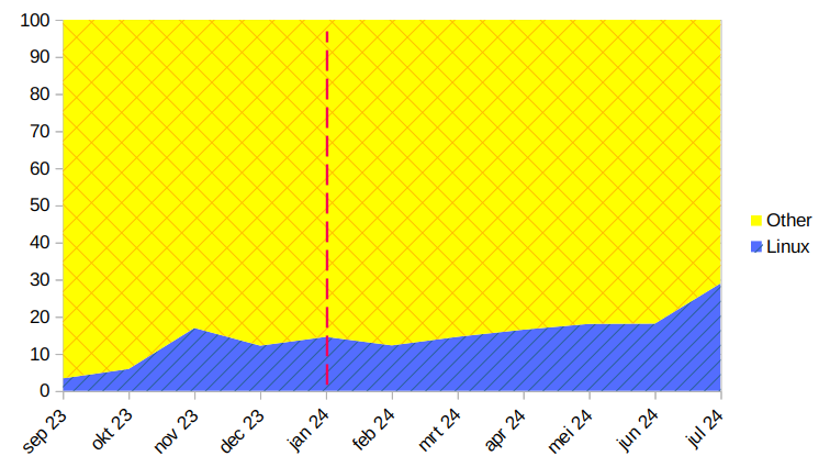
Source
Linux currently 29.1%
Sample size according to StatCounter: 24,353,436 page views

What’s the source for this image?
I downloaded the data from globalstats statscounter
How do you make the graph? What type of graph is it?
So I can use it for browser marketshare and search engine marketshare.

This graph gives me some Corona flashbacks.

Is that where all the government computers run Ubuntu?
I’m a Norwegian Linux enthusiast and have never heard anything about the government using Ubuntu or Linux. Seems unlikely, from what I know. I know that within healthcare Windows is still widely used, even on the server side…
On the other hand, a lot of software for official services is being developed as open source now, so that’s at least a good step in the right direction. Example: https://github.com/navikt


Linux on all their electric cars, and they’re watching porn while driving ;)


I especially appreciate that the graph is designed as “Linux” and “Other” instead of “Windows”, maybe “MacOS” and “Other”.

