


This is ridiclous
Wait, WHAT?
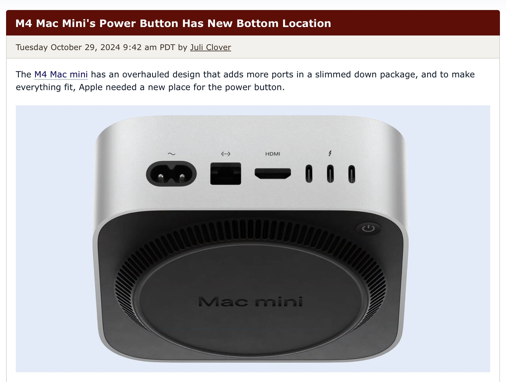
They put the powerbutton on the underside?
For fuck sake Apple…
It’s very bad idea to put power button under the bottom, Who think the designer should need to be fired here
Wouldn’t surprise me if it was the same guy who put the charge port on the magic mouse on the bottom.
That at least has a logical excuse if dumb as hell, this has zero reason to be like this
Apple didn’t want to muddy their nice design by including functions.
Frankly you’re lucky it has any ports
“Our new Mac Mini is so powerful, so extraordinary, you’ll never want to turn it off.” – Tim Apple, probably.

Uh how often are you having to power on your Mac mini? I think mines been off like twice last year.
Having the power switch away from where I often blindly poke around to plug cables in, sounds like a good choice.
Damn, that is some amazing copium…
They had a well established place for the powerbutton, why change it?
As an IT guy, if I worked with Macs this would be terrible to work with
Well first off if you look at the picture, this is a much smaller device. If the power switch was in the same place as the larger case it would be on the side edge.
Secondly because it’s now moved into a space where it’s not going to be accidentally hit, and requires an intentional effort to press.
That’s great, how many IT guys have to manually go around turning off hundreds of computers at the switch instead of running some automated method across the whole network? Such a rare and unlikely situation that the average home consumer and user of a device such as this really doesn’t ever have to factor in.
As an IT guy, if I worked with Macs this would be terrible to work with
You know, now that you say it, I’d bet that’s exactly why they did it. They probably want to fuck over companies that would otherwise have racks of Mac Minis (for clusters, colocated servers, etc.) and force them into Mac Studios or Mac Pros instead.
Not sure why you’re getting downvoted. The only time I use the power button is when there is an issue which has been like 4 times in 3 years maybe? I think people complaining about the power button location have never worked with macOS and are used to shittier standby in other operating systems.
I’ve never owned any Crapple stuff and never will, but even I can see from the thumbnail that the circular vent is lifting the whole unit off the desk, so slipping your finger under to switch it off is going to be a bit odd the first time, then you’ll instinctively know where the button is.
We’ve been doing it with monitors for decades
On the one hand, I agree. Apple has positioned their power buttons with the assumption that the devices wouldn’t be turned off very often for quite a while now. It was on the backside of the previous mac mini design and also on the backside of the 2013 trashcan mac pro, for example.
That still doesn’t make it less annoying though. We use a lot of macs for work, including aforementioned mac minis and mac pros and we do turn them off regularly because there’s no need for them to use power 24/7. Having to turn them around to find the power button is just stupid. That’s form over function in its finest. But if you’re the type of person who never turns off their computer, obviously it doesn’t really matter.
That’s not to say, that the new mac minis aren’t remarkable machines. The redesign was necessary and is very good in general. It’s a tiny powerhouse. They could’ve just chosen less of afterthought of a power button location.
I feel like it’s such a waste of energy when powering off your computer when you’re not using it is so easy.
The standby drain is negligible and it allows for the device to stay updated and synced.
Startup power consumption is a LOT depending on how much needs to open.
For work my i9 laptop spends about 3 minutes chugging down 60-100 watts. An M1 Mac mini draws 5 watts fully powered on and idle. Sleep the machine draws less than a watt. The idle power of the power supply just being connected to the wall is going to use more power than that.

Yes, and if you complain to much they’ll put the power input on the bottom too next year.
Why can’t they put the power button on the front where it belongs. It’s already stupid that they put it on the back, putting it on the bottom is downright idiotic. If they don’t want to mess up the oh so important Apple aesthetic just make it an invisible touch button or something. Apple hates usability.
Desktop macs (not tower macs) has had the powerbutton on the back for decades, it’s fine, bottom is shit though…
Back is already bullshit. We have a few trashcan mac pros at work and usually they’re just turned so all the cables stick out towards the user because then you can easily reach the power button. Which makes it look worse than just having a power button in an accessible place aka the front or the top in the first place.
For you to put your nasty fingerprints all over it?? I don’t think so
- Apple, probably
Part of the new Apple power bottom design strategy.


On the bottom, in the back…


