

The nation of Buffer is about to go crazy with solar, good for them!

Great example of how to pad your chart to push an agenda. Granted, I am for this agenda, but this kind of stuff definitely detracts from it.
Sorry, maybe I was too quick to jump on the hype train. Could you elaborate what’s wrong with it? This might also be interesting to read spelled out for others.
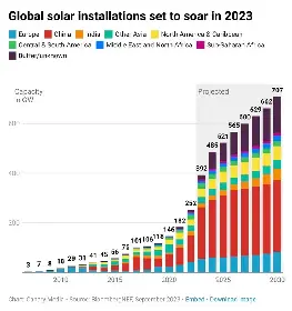
Besides that first year jump by China, most of the growth there is in the Buffer/Unknown section. Remove it, and the chart looks a lot less impressive.
This graph does what every other predictive graph does, cuts the superlinear growth short just after one year. It’s guanteed to be very wrong. At some point we will have way more solar than needed and it will severely flat out, but I don’t think is even close it it.

When I read this type of projections, be it energy, money or whatever, it is always the next year that is exploding in volume
Good! Between regular renewables, I wish we had more fission development though as they are actually greener per kW produced interestingly.

