
Edit: I meant the ui on android 12+

I like it a lot. It makes the device feel really cohesive between apps. And changing the color every now and then feels like a breath of fresh air. Also, the pastel colors help to get rid of blue/grey tones which is easier for the eyes.

i hated material ew as soon as it was announced. so much padding everywhere, and so little contrast - to paraphrase the incredibles: if everything’s orange[1], nothing is. your eyes will adjust to it. i want actionable items to stand out, not be a slightly lighter shade of the same colour. it also looks rather like a fischer-price my first phone interface
i must say, if an app (for example, jerboa) uses material 3, i usually try to look for an alternative
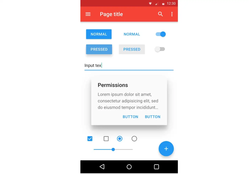
some examples:
with material design, it’s clear what’s a header, what’s a footer,[2] and what each button’s state is.
with all the padding, there’s also less space; leading to less functionality
with material ew, it’s much harder to tell at a glance what each app is, one has to scrutinise the icon rather than just tell at a glance by colour
i also really dislike monet; the way it pulls this horrible washed out sickly pastel colour from a wallpaper and washes it over the entire app. if i just pulled one accent colour, and applied that to, say, the header and main action button, i’d like it a lot more
original comment
another thread in the same post
much harder to tell at a glance what each app is
Is that a Google launcher issue? I’m using Nova Launcher and my apps are still all different colors, the app icons don’t use the material you color.
it’s a google launcher “feature”.
it’s only available on a13, i think, and not all launchers support it. but it is part of the m3 design language, so i included it as an example

I love it. Also makes it easier for app devs, like myself, to build an app that blends in with the device you’re using it on.
strong dislike
everything is bloated and round, the quick settings tiles are too large, like it was intended to be used by a grandma
the colour scheme outside pixel is too unsaturated, oneui and aosp roms are not as colorful as pixel ui because google copyrighted it ig

I like it.
I always liked the material design interface. How smooth are the corners etc.
And now with material UI the apps integrate better with the theme’s primary colours. So that it’s also cool.
As long as it is optional of course.


