


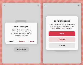
New GNOME dialog on the right:
Apple’s dialog:
They say GNOME isn’t a copy of macOS but with time it has been getting really close. I don’t think this is a bad thing however they should just admit it and then put some real effort into cloning macOS instead of the crap they’re making right now.
Here’s the thing: Apple’s design you’ll find that they carefully included an extra margin between the “Don’t Save” and “Cancel” buttons. This avoid accidental clicks on the wrong button so that people don’t lose their work when they just want to click “Cancel”.
So much for the GNOME, vision and their expert usability team :P
I hope they continue learning lessons from other OSes.
I’m feeling like you are wrong about them outright copying. Some good things can be taken from macOS and Windows. But a lot of bad things too, which is why they are thinking it through.
Please do not reduce the community effort to “cloning macOS”. It’s insulting to the people working on it… Apple doesn’t own modals or modal design.
Here there are not 20 ways of putting 3 buttons in a modal. They just happen to choose a way that will also work on mobile I guess.
Kudos for noticing this extra space which could enhance these kind of modals though.
I don’t like everything Gnome has been doing, especially with the lack of customization or the status bar. But Gnome has been my go to for 7+ years and I like where it is going. Extensions are pretty fly too 👌

Sometimes when you get UI experts and users and engineers in the same room they iterate to similar outcomes because its the logical conclusion. Apples design in this case isn’t ground breaking or even original.
If multiple species of jumping spider can independently evolve the ability to see red from different branches of their family tree, multiple dev teams can come to the same conclusion about what is more comfortable for reaching with consideration for left and right handed people on various types of screens.
The problem is so scoped these days, its fairly logical for UIs to come to the same outcome.
Please do not reduce the community effort to “cloning macOS”. It’s insulting to the people working on it…
Well, it’s insulting for people to lose their work because someone did a lousy UX job. :)
Cloning macOS should not be views as something “bad” because for what’s worth we all know Apple spends a LOT in usability research (they’re not as good as they used to be, but still better than the rest).
Kudos for noticing this extra space which could enhance these kind of modals though.
That’s the thing, I’ve basic design / UX training and all the literature on action buttons with dangerous effects tells you to add a margin. Any design undergraduate should also be able to notice that life saver as well… however the GNOME team totally missed it.
This isn’t the first time them failing at basic UX and they don’t like when people try to suggest improvements nor when they later on criticize them.
Just because you like apple doens’t mean that apple does a perfect job and GNOME should copy it. GNOME does a lot of thing better than apple. And microsoft also does a couple of things better than apple. Apple isn’t perfect and microsoft isn’t all bad

Having used OS X, there is no way they’ve done usability testing. Doing basically everything is hard on OS X

Funny enough, I find Gnome to be more consistent and better thought than macOS… But that’s just me.

Indeed, I freaking love GNOME’s UX/UI. But I switched to KDE for Wayland gaming.

These are pretty standard UI patterns.
My point is: if you want to copy / be inspired by others at least do it right.


Gnome is so much better than Mac OS
Also it is kind of insulting to call gnome a clone of something else. It is the work of thousands of people all over the globe. It isn’t trying to be a copy of anything.
It is the work of thousands of people all over the globe. It isn’t trying to be a copy of anything.
There’s a lot of ideology at play here.

I think that a lot of the recent GNOME design choices are merely because they’re trying to improve usability on mobile devices. It also just so happens that Apple is trying to make the macOS desktop closer to iOS to encourage people to move from Windows. They have similar goals, which leads to similar design choices. And all design is derivative, anyway. Who cares.

