


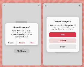
New GNOME dialog on the right:
Apple’s dialog:
They say GNOME isn’t a copy of macOS but with time it has been getting really close. I don’t think this is a bad thing however they should just admit it and then put some real effort into cloning macOS instead of the crap they’re making right now.
Here’s the thing: Apple’s design you’ll find that they carefully included an extra margin between the “Don’t Save” and “Cancel” buttons. This avoid accidental clicks on the wrong button so that people don’t lose their work when they just want to click “Cancel”.
So much for the GNOME, vision and their expert usability team :P

Both designs are good imo. Adding the extra space for the “cancel” button could cause a copyright claim so I think that’s a viable reason why it’s absent in GNOME. And I don’t see anything wrong in copying Apple design. They can do what they want and the new design is very nice in terms of ease of understanding and accessibility potentials. GNOME’s workflow is similar to Apple’s so why not copy some more things for better consistency?
Both designs are good imo. Adding the extra space for the “cancel” button could cause a copyright claim
What ahaha since when a modal is copyrighted? I don’t buy it, this is simply poor design by the GNOME team.
GNOME’s workflow is similar to Apple’s so why not copy some more things for better consistency?
Exactly my point, but they should learn how to properly copy things. Or at least think about them, Apple didn’t add the margin for no reason.
I get it that you hate this design and its obvious strong inspiration by Apple but accusing GNOME team in being lazy is too much. They created the most popular and one of the most stable DEs on Linux and their own workflow that’s similar to Apple’s but still is unique. Also when I saw that new design, I was amazed. To me it looks really great. It’s going to be a good update with accent color support (I won’t fight about it ok?) for sure. It’s just a matter of preference. Both designs are good enough technically imo.
I get it that you hate this design
I don’t hate it, it looks better than what was there before, no doubts there, but at the same time they could’ve just made it better.
All the literature on action buttons with dangerous effects tells you to add margins, accents and shades. Any design undergraduate should be aware of this, however the GNOME team totally missed it.
It’s going to be a good update with accent color support (I won’t fight about it ok?)
It’s funny that you mention that because…
In macOS, you can specify an accent color to customize the appearance of your app’s buttons, selection highlighting, and sidebar glyphs. The system applies your accent color when the current value in General > Accent color preferences is multicolor. https://support.apple.com/en-mt/guide/mac-help/mh15217/mac
I’m totally okay with “being inspired” (cloning) macOS, it should be viewed as good thing because Apple does spend a lot in UX research however lets make thing properly.
the most popular
Citation very much needed
one of the most stable DEs on Linux
Hardly, but I’m guessing you’re thinking of reliability instead. Not really surprising when it’s so stripped down that vanilla GNOME is pretty much unusable. When you extend it, in order to get a proper DE, that goes right out the window.
That fact makes it especially funny that vanilla GNOME is by far the fattest DE around. How it manages to use up more resources than KDE is beyond me.

We shouldn’t design desktops to avoid copyright claims. Desktops should just create original designs that make sense for the goals of the desktop. We don’t need to make changes based on Windows 11 or Mac OS. They aren’t separate entirely and irrelevant.
Do you mean that any copying is bad or any copying is ok as long as it helps achieve the goals?
When you copy the outcome is almost always going to be worse than the original. Do your own thing and be the person or project you want to be. You don’t need to care outside of the project.

They should simply find the courage to implement Apples Human Interface Guidelines. It wont hurt and they are almost there anyway.
That’s my point. :)
However for this they would need to admit to themselves that they’re essentially a copy of macOS.
I totally agree - Apple invested alot of cash and time into this, just take it and make it better here and there. Just a few steps left :)
just take it and make it better here and there. Just a few steps left :)
You mean, copy it and make it open :P I guess something along the lines of https://github.com/CuarzoSoftware/Louvre
@ehopperdietzel is working on that it seems.

At least it is not a cheap copy of Windows.
I don’t use KDE as my daily driver but it’s on my SteamDeck and I haven’t once been trying to change a setting or something and encountered a window that looks like Windows XP because no one at a whole multi-trillion dollar company could be bothered to update it. It’s way better than Windows 11.
If you’re going to give GNOME shit, at least let it before how much they destroy portability of GTK, enabling cancer like Client Side Decorations, and ignoring their community when it comes to things like desktop icons.

I find that “carefully included extra margin” outrageously ugly


