

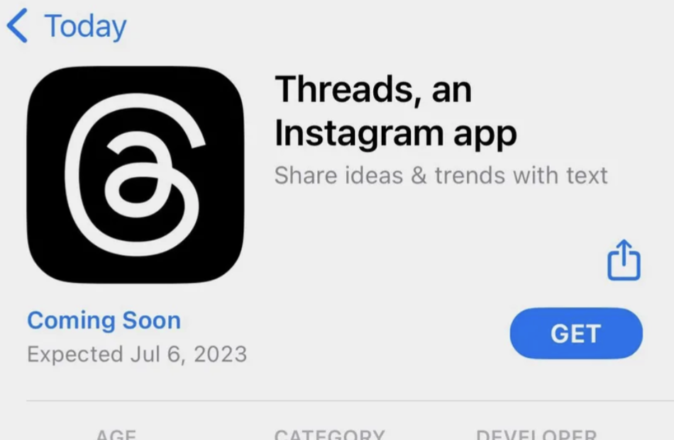
Millions of dollars and a team of some of the world’s best designers and this is what they came up with?

5 points
I don’t know about you, but it looks kinda sus ඞ
4 points
Looks like the Tamil language alphabet கு .
3 points
*
lol, looks like they just ripped off used the ol’ @ symbol, used a two-story ‘a’, made the loop go the other way around, and simplified to a curvy line… really curious how much they spent to come up with this. could have at least used the letter ‘t’ or something. or their little infinity symbol…
totally agree there’s unintended images I see in this.
edit: commenter is correct, thank you
3 points

2 points
1 point
*
3 points
It’s giving ඞ
3 points
It honestly conveys it’s a trap


