

Millions of dollars and a team of some of the world’s best designers and this is what they came up with?
I’m so conflicted rn. On one hand I hate Facebook but on the other I love cinnamon buns. Random app idea (you’re welcome), app on home screen and when pressed places order of 4 cinnamon buns for delivery. “Piping Hot Buns” coming soon to iOS and Android.
lol, looks like they just ripped off used the ol’ @ symbol, used a two-story ‘a’, made the loop go the other way around, and simplified to a curvy line… really curious how much they spent to come up with this. could have at least used the letter ‘t’ or something. or their little infinity symbol…
totally agree there’s unintended images I see in this.
edit: commenter is correct, thank you

Oh my. That’s craptastic. Looks more like grandads silvery pubic hair on a dark colored toilet seat.
Probably equally joyful to discover.

It’s giving ඞ

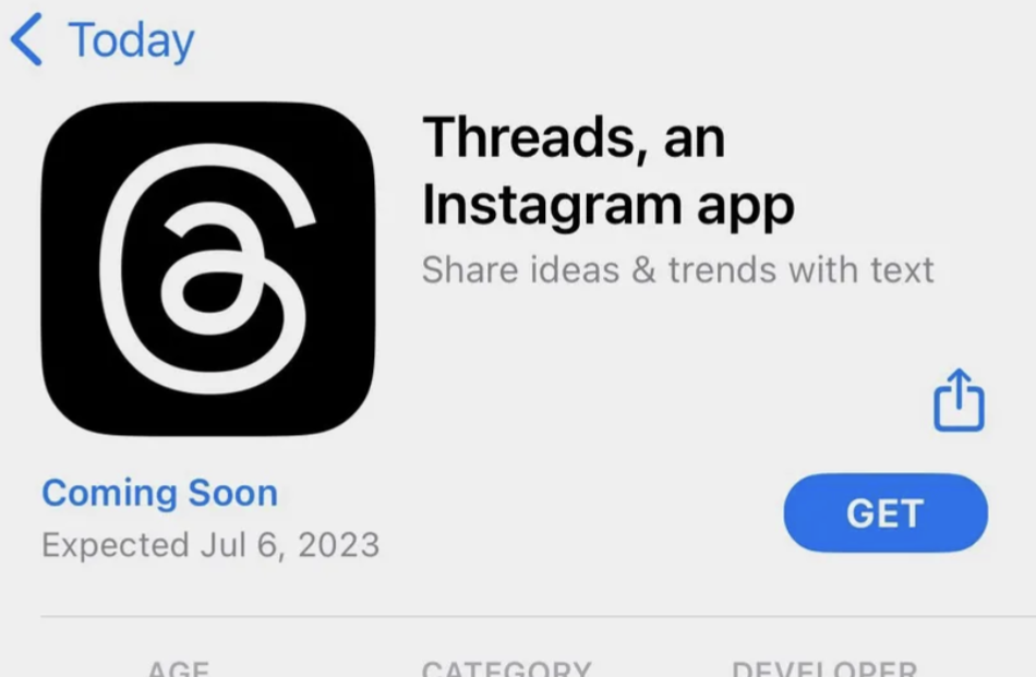
It took me a moment to realize that this is the new Meta thing. At first I thought it was about some new client app or something.
THIS is their actual logo? Who’s kid was commissioned for this masterpiece?

