


And no, I will not tell you what my company app is.
Google and apple already know who you are, the company at the bottom doesn’t

Wrong, the google product is dead

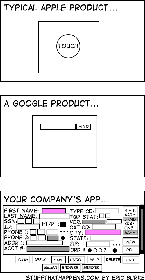
People at my company are like “why are we wasting screen real estate with white space?” and I imagine they see the last image is an ideal UX
We’re currently trying to convince our client, that 4 different levels “mandatory” fields in a form are about two too many.
The UI they sketched looks like shit, but they think it’s absolutely necessary.

But there was this one customer, where it was so helpful to know he’s left handed. So now this is a necessary information /s
For the first two you need hoops and tricks for it to do what you want, the last one has bad UX. I choose the later.
I would argue that the first two require you to jump through hoops for edge cases, while the last one requires you to jump through hoops for every case.

Without knowing what the user is actually doing, that’s impossible to know. If the user has to input all those fields on a regular basis, then that one screen is the superior UX.

If I’m going to jump through hoops anyway I’d like some degree of control over the experience.

The flipside is that all of the stuff you actually use is buried five levels deep.
Apple/Google/Other Companies way, way over-do this. Clean, modern design is one thing, but avoiding all text, making things too small to see, and being unable to tell which option is highlighted, etc, all at the expense of the actual UX is such an annoying trend and I’ll never like it.
I’m a Millennial so of course I don’t have a lawn, but get off it anyway…

more checkboxes == more better

I loved making interfaces like that for internal systems in the past. I’d find a way to put everything relevant on the screen and able to be read or interacted with any time it’s necessary. I also had it flow top to bottom and left to right, because there was typically a physical process step associated with that station.
Honestly, I’d rather have an ugly app with everything right there than the terrible UX trend that’s happening of everything being hidden behind 8-10 different menus just to make the home screen “clean”
It would be hilarious if all these apps were secretly just like vim. They all have complex hotkey setups that enable power users to get where they need to be in at most 3 key presses.
And the unititiated has to google to find where their god damn setting is actually located.
Honestly that would be great.
Very often they do. Many of these internal applications are from mainframe computer times when interacting with applications exclusively via the keyboard shortcuts was the norm. In most companies, they never dared to remove those because the Power Users are used to them for decades.
Problem is, few people are trained directly by those power users so they never learn those efficient shortcuts. And they are never well documented.
One of my favorite extensions is vimium. It enables vim like navigation on web browsers. If you press ? It brings up a menu showing all the key bindings, it’s very helpful. Adding that and a hotkey highlighter would be a good way to document such programs. It’s too bad that sort of thing isnt a priority
On the one hand most power users feel this way. On the other hand power users probably aren’t the majority of users (although it depends on the product).
The trend definitely comes from the fact that new people get overwhelmed by cluttered user interfaces. But just having a clean initial screen doesn’t mean good UX. Good UX is the art of providing a clean, logical user interface that’s simple and efficient to use. Unfortunately, too many companies just go for minimalism and wind up with things both taking longer and ending up being harder to use.
