


who even decides what’s “modern” anymore?
can anyone, honestly, without reading the article (or guessing from the headline), tell me which of these is the "modern" design?
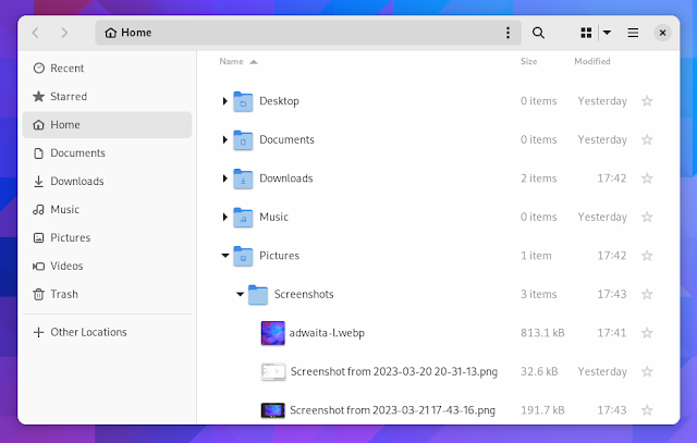
edit: people are getting confused by the fact that one is tree view, not icons view so i changed the image. old image here

I think “modern” can be interpreted as nice and clean UI which is beautiful to watch and only the absolutely most important stuff is shown and the rest is hidden. So, like apple design approaches, I guess. Say form over function. Microsoft tends to go that route as well. Luckily for user who like function over form, there are different flavors of Linux.
Clearly the dark mode is the modern one! Jokes aside, I just realized that there THREE menu options on that toolbar: hamburger, kebab, and waffle! I realize they do different things, but no wonder people are confused by and scared of computers. Also, now I’m hungry!

Since the kebab menu is inside the location/search box, I’m guessing it contains search-related options.


It’s just my opinion (since it’s not in the article) but a thing that makes Gnome and Libadwaita a “modern design” is the fact that the production behind it tries to bridge the gap between a “mouse and keyboard” and a “touch screen” workflow.
None of the other DEs come even close to Gnome when used on a tablet
meh, subjectively i find that creates a “worst of both worlds” situation. but this comment was more about the futility of the development time that went into this specific feature
this comment was more about the futility of the development time that went into this specific feature
yeah sorry, I should have been more specific with my answer: features like this are supposed to help you in a touch screen situation or in general with smaller screens.
When the window is resized under a certain size, the left panel becomes hidden and with it part of the top bar, to make it less cluttered and confusing.

Well the dark mode screenshot makes less efficient use of space so it must be the modern one.
List/grid view are in the top right. This is an unfair comparison having one in list and one in grid, when they both clearly have a button (in the same location even) to switch modes.
Dark is clearly the modern one though, but presumably you can switch between dark and light.
It’d be kinda nice if they made these kinds of changes options rather than just deciding this is best
Could honestly take it or leave it, doesn’t really add anything
i’m not even sure it’s worth having an option. i don’t think i’d even have noticed a difference, apart from the menu button being in a slightly different place to every other gnome app. it’s fine; but it wasn’t worth the development time

The last thing I want is an option for this. My gosh, imagine the amount of options you would end up with if every single design choice was turned into an option. Who in the world would like that many options.
I’m happy to just have a design team work on whatever they think looks better and works best for the user experience, and implement it after some rounds of public review and testing. This looks neat enough to me - slightly less cluttered than what my current Nautilus window looks like while maintaining the same functionality.
Well I just switched to KDE Plasma last week and I’m pleasantly surprised just how many things are configurable via a menu and how well it runs on Wayland With a Nvidia GPU.
I used to despise KDE Neon, and used Gnome for a bit, but I don’t think I can go back anymore until their design philosophy changes again.

Honestly, I haven’t yet seen the article, the light theme one is probably newer because of tabs.
Anyways both look like an android app, I know most will hate reading this but Windows Explorer rules.

I’m very glad GNOME does such an amazing job staying modern in its look. GNU+Linux and free software would be much worse off without it.

Great. Now do split panel!
I’d love a setting to change the default file manager. I always install Nemo and configure it to be the default but last I checked, it’s not a simple GUI setting like changing the default browser or email client or whatever. And then you end up with two programs called “Files,” which obviously isn’t ideal.
Would it be that much of a problem to have what app is “Files” be a simple setting? Maybe it’s way more complicated than one assumes.
My dream is that one day we will be able to assign default applications to the “generic” names in Gnome. Launch “Browser” and open Firefox (or chrome 🤢), Files and open Dolphin, Messages and open Elements etc etc.
Obviously I can do the same with custom .desktop files but it would be a nice flair to use the settings to just assign applications to those generic names.

Maybe they added this when I wasn’t looking. It’s been awhile since I did a fresh install of a Gnome distro. (I use Fedora for work stuff and I’ve learned over the years to leave my work laptop the fuck alone and distro hop on a personal laptop.)
It’s still a problem. And then once I finally set thunar as default, Firefox continues to open Nautilus. Removing Nautilus isn’t an option either since it’s a dependencie of something else.
I really hope choosing a default file manager woll be simple and always working at some point.
Most DEs do include the file manager in the default applications menu. You can also use xdg-mime to set it as the default for inode/directory
Until some app doesn’t care about xdg-mime. At least I had some issues with firefox a while ago.
Firefox uses xdg-mime or xdg portals, depending on the configuration of the package. If you are using it as a flatpak, it will use portals.
Apps using portals will use the file picker your portal provides. This will usually be either the GNOME or Plasma file picker. Note that this file picker is separate from your default file manager.
I don’t think I can go back to Nautilus after using Dolphin for so long, even if the search is far better.

