

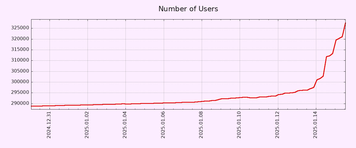
Editing to let people know that I will be blocking anyone who feels the need to tell me why this graph is inaccurate. I truly don’t care, but feel free to chime in with your useless take and land a spot on my block list! 🙂

To be fair, the Y-Axis doesn’t start from zero.
That being said, 10% account growth in 2 days is pretty solid. Let’s hope both account creation and engagement metrics (MAUs/DAUs) keep growing.
EDIT: Correct Axis type.
Pedantic: You mean Y-axis, right? Technically, neither start at zero but I think you meant Y based on context.

I actually wish this were true. Sure, they would show the snippet for the time we care about, but they MUST provide the source graph that contains all data back to the Big Bang. Specifically the Plank Era, we don’t want a graph where time doesn’t exist, that would make the graph useless.
I know this might not have been the intent of the post, but this is super fucking helpful. I’ve been using blender and Unity and didn’t understand why I was getting confused around grid cords, it’s cuz I didn’t realize the orientation changed (I just move the arrows around mostly, just a noob). By any chance is there anyway to change the orientation? Hopefully?
Yes, of course the Y axis.
I work with charts/vizualizations/data a lot, but for whatever reason I reflexively mistake X/Y a lot. It’s not even funny.

I make the same mistake all the time for some reason, though I know which is which. I have a theory the reason is that the X axis is often used to plot years (Y), which messes with my brain ever so slightly.
That said, I don’t think the Y axis should necessarily start in zero in a graph that seeks to show the pattern of growth rather than the number of users in absolute terms. If anything, a longer X axis would have been more useful, in order to show how unusual such a growth pattern is.
Isn’t that a 1‰ growth or am I mathing wrong?
Edit: I’m wrong and that’s why I shouldn’t comment first thing in the morning. The math is mathing, I’m just not braining.
Starting the y-axis zero wouldn’t change the shape of the curve at all, but it would make the increase seem less dramatic.
It’s a ~10% increase, but the scale makes it look like the count shot up by 10x at first glance. I know that’s why you always need to look at the axis labels, but graphs like this are purposely presented this way because they’re easy to misinterpret for the average person.


