

Editing to let people know that I will be blocking anyone who feels the need to tell me why this graph is inaccurate. I truly don’t care, but feel free to chime in with your useless take and land a spot on my block list! 🙂

Lies, damn lies, and graphs that don’t have the Y-axis starting at 0.
10% growth in a day is nice, but far from a revolution. Let’s see this trend going for a month.

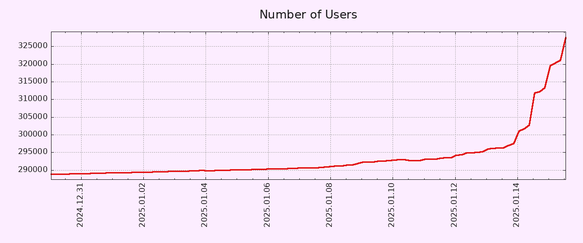
Monthly active users increased by 43% between 13 and 14 January: https://pixelfed.fediverse.observer/dailystats

I don’t think anyone here is arguing that the entire world will be using pixelfed by the end of the year, and that its usage will expand to other galaxies by the end of the decade.
It’s a comment about the current growth curve, and it is both accurate and interesting.

I’ve never been on IG but I’m strongly considering a pFed account. Am I churn or am I miniscule net-new?
And yeah, it’s a hope that the rumoured meta toxicity is somehow magically not on pFed. I wanna see my nephew’s designs and art but not the influencerati junk I fear is on the captive platform.
The y axis starting zero does not change the fact that it’s exponentially growing right now. Filter that link posted below for 120 days and it is still a nearly straight vertical line of growth.
It’s not exponentially growing. At best, the growth rate has exponentially increased. These are VERY different things.
It was exponentially growing, the platform would come screeching to a halt and crash.
Jesus fucking Christ, you people are miserably pedantic. Nothing about my original post is wrong, so please kindly shut the fuck up with your “well achtually” takes.
The only thing worse than misrepresentation of statistics is completely misguided criticism of statistical representation.
While we’re at it, the X axis doesn’t start at zero either.
It’s the perfect combo of karma farming and “well, achtually” to make your blood boil. Good thing karma isn’t a thing on here from what I can tell.

To be fair, the Y-Axis doesn’t start from zero.
That being said, 10% account growth in 2 days is pretty solid. Let’s hope both account creation and engagement metrics (MAUs/DAUs) keep growing.
EDIT: Correct Axis type.
Pedantic: You mean Y-axis, right? Technically, neither start at zero but I think you meant Y based on context.

I actually wish this were true. Sure, they would show the snippet for the time we care about, but they MUST provide the source graph that contains all data back to the Big Bang. Specifically the Plank Era, we don’t want a graph where time doesn’t exist, that would make the graph useless.
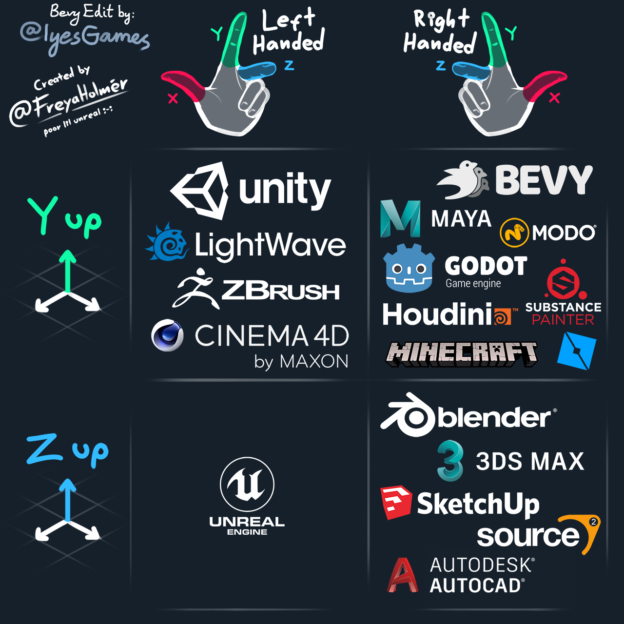
I know this might not have been the intent of the post, but this is super fucking helpful. I’ve been using blender and Unity and didn’t understand why I was getting confused around grid cords, it’s cuz I didn’t realize the orientation changed (I just move the arrows around mostly, just a noob). By any chance is there anyway to change the orientation? Hopefully?
Yes, of course the Y axis.
I work with charts/vizualizations/data a lot, but for whatever reason I reflexively mistake X/Y a lot. It’s not even funny.
I make the same mistake all the time for some reason, though I know which is which. I have a theory the reason is that the X axis is often used to plot years (Y), which messes with my brain ever so slightly.
That said, I don’t think the Y axis should necessarily start in zero in a graph that seeks to show the pattern of growth rather than the number of users in absolute terms. If anything, a longer X axis would have been more useful, in order to show how unusual such a growth pattern is.
Isn’t that a 1‰ growth or am I mathing wrong?
Edit: I’m wrong and that’s why I shouldn’t comment first thing in the morning. The math is mathing, I’m just not braining.
Starting the y-axis zero wouldn’t change the shape of the curve at all, but it would make the increase seem less dramatic.
It’s a ~10% increase, but the scale makes it look like the count shot up by 10x at first glance. I know that’s why you always need to look at the axis labels, but graphs like this are purposely presented this way because they’re easy to misinterpret for the average person.
For other nerds that absolutely hate dishonest and biased graphs, I present the normalized data. Wow. What a vertical line. 🤦♀️

its the federation effect in action. I expect pixel fed to get a slow trickle of new users as legacy social media cages and milks its current users for ads.
Despite the misleading graph from OP, the slow uptick seems to be common with federated social media because there’s little incentive to make viral posts to sell ads.

Just a FYI, Dan who made Pixelfed also does Loops and a few other Fedi projects in case people want more cool stuff to play with.
What is the general outlook on others helping him build them out? I would hate to see tons of the energy dissipate because it was one guy trying his damnedest to out compete tech companies on two fronts.

I signed up, though I generally don’t like following individuals and much prefer groups or communities like Lemmy. Gotta support independent social media.

This also works really well for Mastodon. Gets your feed going super easily.
this is probably the intended method to use mastodon, if you’re trying to follow individual accounts you’re just gonna suffer.
I also found actually taking time to find an instance that you vibe with (in my case, jorts.horse) really helps to keep stuff interesting in your Local timeline. As a bonus, it also furthers decentralization :)


